


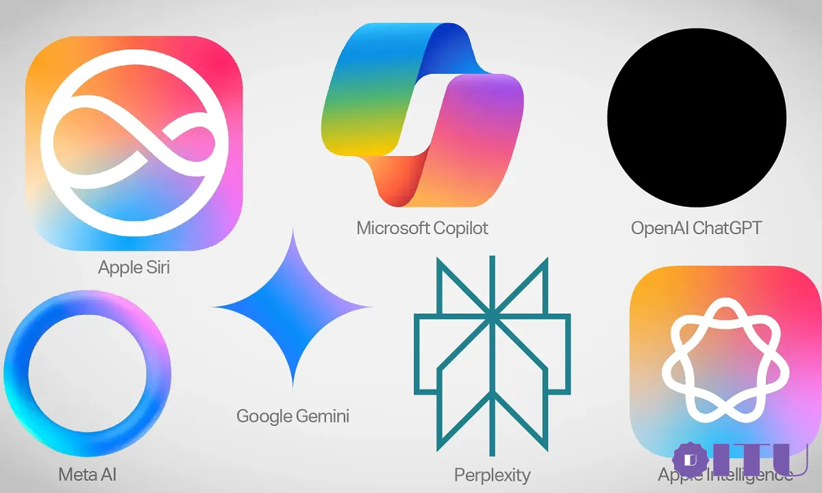
Apple, Google, Microsoft, or OpenAI all have logos for their AI tools, but most are criticized for being difficult to become a common icon.
Apple has now joined the generative AI race with Apple Intelligence. Similar to other software, the company also introduced a new logo with infinity-deflected circles inside placed on a colorful background, and the Siri virtual assistant logo was also redesigned.

AI logos of leading companies. Photo: Tech Crunch
The “big family” of AI logos also comes in all shapes: from ChatGPT’s “black hole”, Meta AI’s multi-colored circle, Google Gemini’s stylized diamond to Microsoft Copilot’s multi-colored but “confusing” image. However, most don’t show universality like email letter logos, upload/download arrows, or magnifying glass icons in search.
“The colorful shapes people are seeing seem to just want to convey that this interface is not an email, not a search engine, not a note-taking app, rather than immediately showing that it is an AI tool,” Tech Crunch commented.
For example, with email logos, they are created with an image of an envelope, giving users an easy-to-understand, easy-to-visualize feeling of a letter. Inside, the send symbol also takes the form of a horizontal pointed arrow, sometimes split in half to signify a moving document.
Meanwhile, the Settings icon uses gears or wrenches, suggesting installation with motors and machines. In some cases, the icons are somewhat more abstract, like the up arrow showing the upload and the downward arrow to indicate the download. Similar to cloud computing, it is a cloud drawing with a downward arrow.
AI is still a new concept for many people. The original AI symbols were small robots, witch hats or magic wands – things that signified novelty. However, they are gradually being replaced due to rigidity and limitations: robots are just hardware machines that are programmed and perform predetermined tasks; Magic wands are easy to associate with irrational, inexplicable, or mysterious inventions, so they are suitable for more creative tools.
According to graphic experts, logo design is a “strange blend” of a strong vision, commercial effect, and compromise of the requester with the designer. Meanwhile, so far, AI is still considered “a very general category”. Companies that provide AI products don’t want to be specific because in doing so, they may imply some things AI can and can’t do.
However, companies are still forced to choose a “face” for their AI model. Except for OpenAI choosing a simple black dot for ChatGPT, most of the rest of the logos are colorful, especially blue and purple. They may not have much meaning, but they create a sense of playfulness and approachability, aiming for softness or even childishness.
“Until AI is more clearly defined, the symbols that represent it will continue to be vague shapes,” Tech Crunch commented.